yegdt: Land use in downtown Edmonton - preliminary analysis
Edmonton's downtown is a growing and changing entity. In recent memory Edmonton's core has gone from being mostly dead, to having a few sections of vibrant life with interesting restaurants, bars and a wide range of events. On an infrastructure level, the core is shifting away from surface lots and empty buildings to new developments including high rise buildings such as the Epcor Tower and the Icons on 104th (thanks in part to the muni being shut down). This gives rise to the question of how downtown land is being used. So I, of course, made a map.

The area of this map is defined by the City of Edmonton's Downtown Neighbourhood Boundary. The black polygons on this map represent surface parking lots (~15% of the downtown area). The surface lots, in conjunction with roadways (~12% of downtown area), represent about 27% of the surface area of downtown core. Buildings occupy 25% and parks space 6%. I was astonished to learn that there are over 2800 trees in the downtown, with over 25 species (tree data from data.edmonton.ca). I captured each one. Rather than document each tree in a huge legend, I created a teaser that allows you to mouse over each point to discover the trees in your neighbourhood.
Some things of note about the map - a full 27% of the downtown core is devoted to cars, and this data does not include parking garages or underground parking. There is more square feet of land dedicated to vehicles than to building footprints, and only 6% to park space. Wow.
There are two main sources of data for this project. One is from an article about parking in Downtown Edmonton published on Spacing Edmonton. Kyle Witiw, the author, was kind enough to share his hand-drawn parking data with me. I then downloaded the Edmonton OpenStreetMap data from an OSM metro extracts site, and teased out the various buildings in the core, compared and corrected the OSM parking data with Kyle's data, and mapped it using QGIS + TileMill and MapBox. Kyle pointed out a couple of problems with my data, including:
The surface parking that used to exist on the NW corner of 104 street and 102 ave no longer exists - the Fox One condo development is currently going up on that site.
I have not yet corrected that.
There are some additional issues with these data. The road data is likely an under estimate as I measured the length of the roads bounded by the neighbourhood boundary, and then multiplied each length by the number of lanes (2) and width per lane (3m) to get the total area. I did not account for parking lanes or turning lanes, as such I think that I have under estimated to total surface area of roadways. Also, several park spaces are not in the data sets - for instance the area west of Canterra Centre at Jasper and 109 is poorly documented and does not include the park that contains the walking/biking trail. Also with Canterra, Save-On-Foods is missing, as are the condos to the westThe addition of these residential and commercial footprints would slightly increase the overall built-up area in the core.
In addition, the blue buildings have been classified as a 'mixed use'. The OpenStreetMap data (the basis for the building and park data) does not define the use of the blue buildings. I plan on updating the OSM data so that I can, in the future, produce a better map (I will also update the OSM data with Kyle's suggestion above).In summary, the data needs work and the best place to make data improvements is in the OSM database.
Please feel free to let me know what you think.
Neogeography of Edmonton's River Valley
Neogeography of Edmonton's River Valley
from
Abstract
Presented at Carto2013 on June 14, 2013.
Place can be defined as the meanings that are created at the confluence of location and activity (Relph, 1976). The places that comprise an urban environment are increasingly networked through the ubiquitous disbursement of connected, hand-held, location-aware mobile devices (Castells, 2004). This, coupled with the evolution of the GeoWeb supporting volunteered geographic information (VGI), is defining a key method of citizen engagement with spatial data and information. Specifically, citizens are able to communicate place-based information through these technologies. These emerging phenomena give rise to some pertinent questions: (1) To what extent are GPS systems able to capture users' understanding of location, and; (2) How do people contribute spatial information to the GeoWeb?
Using a case study method that centered on Edmonton’s river valley trail network, 17 informants were interviewed regarding their use of GPS devices in the capture and communication of spatial information, and their corresponding knowledge of place. Our findings indicate that people possess and are able to articulate place knowledge that is deep and personally meaningful, especially in regards to parts of the river valley they use and enjoy most often. However, location-aware mobile devices do not currently provide the tools necessary to communicate users' deep understanding. We conclude that current web based maps that support VGI only allow for a small portion of knowledge to be uploaded. This knowledge is restricted to the structure or form of a place, rather than its meanings or context.
Alberta's New Open Data Portal
A few weeks ago I was asked by the GOA to look at their new Open Data Portal and make some maps with the data. I did, and the maps can be found at my MapBox site. While I think that these are beautiful and interesting maps that tell a story, the important narrative is one of open. Open, in this context, implies a workflow that uses open source software to take freely available data and extract meaning from that data. In this instance, I used QGIS and TileMill, coupled with PostGIS and Open Street Map couple with Natural Earth as the base map layer. These maps are hosted by MapBox. All if it, for free or mostly free. I pay a small subscription to host my maps, but MapBox does have a free option. And these are not the only tools - Google Maps and ESRI also have a range or mapping tools for free.
This context of open includes the users; who are the open data users within this emerging ecosystem open tools?
(1) Government. Either those in the same government from other departments who just need some data to do their job, or other governments all together. When we developed emitter.ca, I was told by an Environment Canada friend that it made there life easier because the data was more readily available and visible.
(2) Journalists. For instance @leslieyoung wrote about her difficulty accessing oil spill data from Alberta Environment and Sustainable Resource Development here. If these data were available in an open portal, journalists could more easily access it for their stories. We want this as the open data provides transparency and accountability.
(3) Researchers and developers can use the open data as the 'base map' or core data sets upon which they place other data or code to extract greater utility. For instance, heath indicators are a great open data set that can take on greater meaning when coupled with research based data such as smoking rates or ambient pollution. Perhaps a developer would build an app that could indicate where NOT to go based on these same health indicators (not that I am advocating this...).
In short, the Open Data Portal is meaningful only when it provides data that can make the data provider uncomfortable and accountable. Financial records (GOA's are here), environmental performance (including, yes, oil spills), meaningful health indicators such as cancer rates or respiratory illness by a reasonable (and privacy protecting) geographic region. These are the squirm inducing data sets.
In this instance, with it's newly launched open data portal, the Government of Alberta has made a bold first step in committing to path of openness and transparency. But, by in large, the data presented in this first iteration are not challenging or likely to make the GOA squirm. Farmers market locations and schedules, eco zones, sensitive species. Nice and interesting, but not hard. The hard data will relate to the oil sands and oil transportation network within Alberta. These data will document health outcomes by health region; will undercut the substantive pay wall that the ERCB has around the most valuable data (see here). So, a great first step, but only a first step. The hard work is yet to come.
In the mean time, have a look at the portal, and please peruse the pretty maps I made, and let me know what you think.
In The News
I was recently asked to make some maps with data from the Government of Alberta's new Open Data Portal. Here is a video clip that made the local CTV News. A blog post that addresses my experience making the maps and my concerns regarding the portal can be found here. During an open data discussion with various stakeholders and Minister Clement, I said that an effective open data portal is one which causes discomfort for the government hosting it. I don't feel that this GOA data portal is at all challenging as there are no difficult datasets to be found. For instance, there was a recent slurry pond leak from a coal mine near Obed AB that leaked 'toxins' into the Athabasca River. The data associated with that release, which clearly makes the Government of Alberta uncomfortable judging by their media, should be on their open data portal. Sadly, the video has not sound. Working to fix this.
ctv_interview from Matthew Dance on Vimeo.
Alberta Road Map
I was intrigued by the American Road Map that made the rounds on Facebook and Twitter last week, and wondered how hard it would be to make one for Alberta. Not too hard! Data from Open Street Map. GIS from QGIS and Mapbox. Full size map can be found on the Mapbox site.
[mapbox layers='mattdance.Alberta_Roads' api='' options='' lat='53.5472' lon='-113.55669999999999' z='8' width='700' height='600']
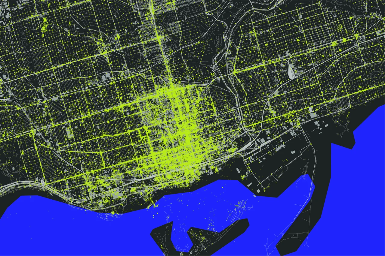
Toronto Tweets
There is an emerging narrative that characterizes Twitter as a tool of public engagement that can augment more traditional means of consulting with the public (for instance, see here for Environment Canada's commitment to "...implementing more avenues to facilitate online connections with partners, stakeholders and interested members of the Canadian public") . While there is no doubt that there are many many people who use Twitter (it is reported that there are over 200 million active Twitter accounts) as a mean of conversing with their elected officials, it is important to remember that Twitter does not include all voices within our Canadian cities. This blog post is an attempt to understand who might, in fact, be Tweeting within Toronto in a effort to understand who might be Tweeting about Toronto. About this map

[mapbox layers='mattdance.toronto_tweets' api='' options='' lat='43.65969596299056' lon='-79.38002295227051' z='15' width='600' height='400']
Above are Twitter maps of Toronto that represents all of the geolocated tweets for Toronto in 2011, about 1.5% of the total Tweets (in other words, 98.5% of Tweets are not location enabled). The Twitter data were provided by Trendsmap through John Barratt (thank you!). A full sized version of the dynamic map can be found on the Map Box site.
This was a challenging data to work with as it is so large. I started in QGIS to understand how the data looked and to pair it down to just tweets within the GTA. I moved the data into Tile Mill by Map Box, and layered Open Street Map data to provide visual context for the tweets. The 'heat map' effect that I used is described here, as I was not able to make the QGIS heat map plugin work, for some reason (please let me know if you can help with this). I plan on learning how to build a PostGIS database on my computer so that I can do this.
The idea for the map and post came from these three beautiful and interactive twitter maps: (1) London, (2) New York and, (3) Melbourne.
Observations and analysis
A closer look at the map reveals very dense Twitter areas and areas that are very sparsly Tweeted. The most densely Tweeted area is bounded by Bloor Street to the North and Lake Ontario to the South, connected by Young Street. There is a greater density along the Lake, away from Young to the West. There are also a small number of ghost Tweets on the lake North of Toronto Island.
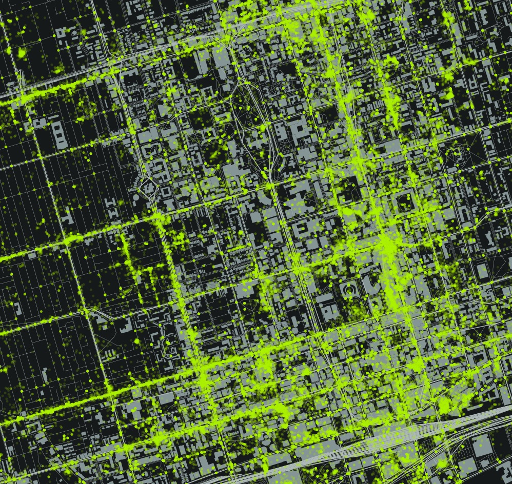
These boundaries are visible in the above image. There are also a couple of identifiable hot spots - the Eaton Center, Rogers Center (cut off in the above picture). The areas described by this Twitter Density also corresponds with the tourist and suburban destinations - the areas around Young - Bloor - and Front Street, including the sports stadiums, are not just neighbourhood destinations, but destinations for those interested in shopping or taking in the sights in Toronto.
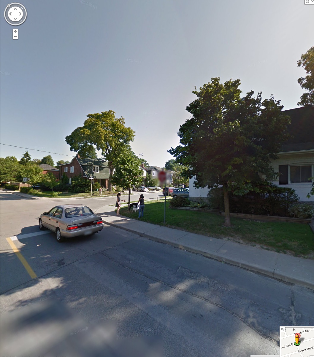
In contrast, those areas that are strictly neighbourhoods, such as Hillsdale Avenue (running east from Young) do not offer that same density.

The above example shows a middle class neighbourhood within Toronto that does not have a large number of Tweets other than the cluster at the corner of Young Street and Eglington Avenue in the top left of the image. The Mt Pleasant Cemetery bounds the neighbourhood to the South.
In addition, poorer neighbourhoods also seem to have a dearth of tweets. The following image is of the Regent Park area between Dundas and Gerrard.
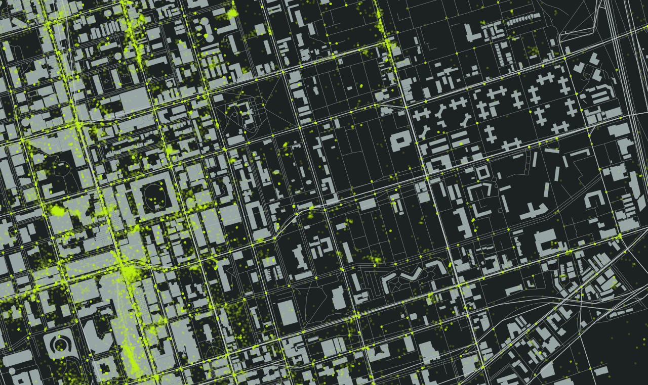
It is clear from the image that many people are Tweeting on Young Street. You can even see a hotspot in the Eaton's Center and at the south east corner of Young and Dundas. Further east, nothing. From the Regent Park Wikipedia page:
The average income for Regent Park residents is approximately half the average for other Torontonians. A majority of families in Regent Park are classified as low-income, with 68% of the population living below Statistics Canada's Low-Income Cut-Off Rate in one of its census tracts, and 76% in the other (compared to a Toronto-wide average of just over 20%).
Conclusions
I suspect that most of the Tweets that occur in Toronto are from those who live in the region, but who may be downtown for some shopping, to take in a game, or other recreation. I also suspect that a majority of those who live in Toronto are a small portion of the overall Tweets in the area between the Lake and Bloor, adjacent to Young.
As you move from this area, I suspect that a greater portion of Tweets are made by residents of those neighbourhoods, simply because fewer 'tourists' would travel to these neighbourhoods unless there was an attraction, such as shopping or food. Although I am only exploring those ~1.5% of tweets that are geolocated, I feel that these are the Twitter users who are most likely to engage with an Open311type of application, to use their smart phones as a means of communicating location details to their municipality. If this is the case, then those poor areas of the city, potentially the most disenfranchised, will become more so (look at Mark Graham's work mapping the digital divide in Francophone Africa).
Air Quality Egg: It's all about the data. Part One
For many reasons the Air Quality Egg represents a profound shift from the current regiem of regulator controlled Air Quality monitoring Specifically, the current model of AQ monitoring sees a regulator (government) define the AQ issue, the substances of concern, and the monitoring response to these top-down defined concerns. The AQEgg turns this model on its head by allowing, though citizen lead (though still early adopter) monitoring technology that is accessible to those who can afford a $185 sensor, or have the knowhow to build their own via 3D printers and electronic schematics. In other words, the model shift from top down to bottom up where a citizen, or group of citizens, can define where monitoring should occur. As detailed in this post, the current AQ monitoring network focuses on a regional level of air quality. For instance, there are three sensors in Edmonton that provide a regional overview of the air quality through a metric called the Air Quality Health Indicator. Southern and Western Ontario have a total of 15 stations (see map below) that provide air quality data for over 6 million people.

The AQ Egg provides three distinct advantages:
- They can be located at street level more easily. We really have no idea what is happening on street level and that the numbers may be well above what the regional AQ network reports.;
- The map provided my COSOM is more interactive and open. In fact, developers have already started developing products in support of the AQEgg. See the Air Quality Egg Helper Chrome extension;
- The AQ Egg data are open and available for download and analysis. This open data philosophy is not consistent across all regulators.
The one big advantage of regulator monitoring is the quality of the sensor, and thus the data where the measure of a sensor is the quality of the data it provides. As stated on the AQEgg wiki "...more work is really needed to make the low cost sensors sensitive to ambient pollutant concentrations." This can be seen in the sensitivity of the NO2 sensor as compared to actual ambient concentrations. In Vancouver, for instance (from the 2011 Lower Fraser Valley Air Quality Monitoring Report [PDF], pp. S-9) the annual average NO2 goal for Vancouver is 40 ug/m3 or less, with the one hour range being up to 122 ug/m3. The range of the NO2 sensor is 94 - 9400 ug/m3, less sensitive than the 'normal' ambient concentrations as detected by the regulator sensor.
Furthermore, the quality of the data is confounded by cold (an issue where I am from in Edmonton), and humidity. Regulator sensors heat or cool the air feed to a standard temperature and strip out any humidity to create a 'clean' sample.
My next post, hopefully coming soon, will examine some of the initial data generated by the AQEggs as compared to the regulator data.
Air Quality Egg: Up and Running
My egg is now up and running! I was able to easily figure out the instructions for connecting the AQE to my computer and applying a software fix to the AQE. The Vimeos for the fix can be found here. There are three components to the AQE that I really like:
- It's open sourced;
- The data streams are easily accessible in various formats;
- A Dashboard to access your data, and the data of those whom you follow.
Open Sourced Air Quality Monitoring

The above schematic is but one example of how the AQE people endeavor to make the framework for the egg as open as possible. Granted, it is an elite person who could go out and build one from scratch, but having everything that goes into the egg available on-line means that individuals can carve off a little section of the project that they can personally improve, and make it better. Perhaps you are not a hardware person, then you can build the software, or perhaps you want to establish a AQE community in your city, or maybe you want to shell out you 185$ to simply monitor the air outside your home. Whatever fits your mood.
Data is available
Granted, this is similar to Cosm's open hard- and soft-ware approach, but it is worth noting based on how accessible the data is. As a novice data user, I appreciate that they support basic graph making within their platform, and provide tools to embed your graph into a blog post, Facebook, or on Twitter.
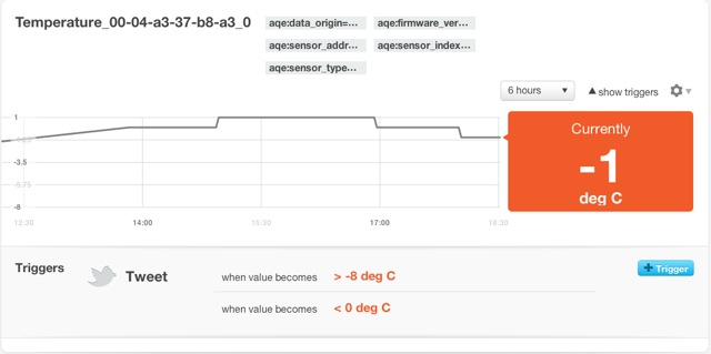
'Triggers' can also be created. A trigger is defines a set of criteria for the data to meet, and if those criterium are met, then a tweet is sent out via your account alerting you, and the world, to the pertinent information. From the image above, an alert will be sent out when the temperature is >-8C or <0C. A user friendly tool that alters you to user defined changes in the data stream.
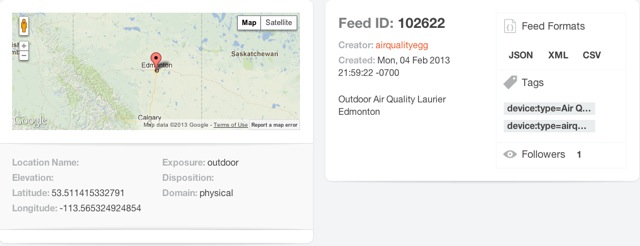
The data is also accessible via JSON, XML and CSV. While I am not capable of creating a data feed through JSON into, for instance, Excel, the feeds are available for those who are. I will, though, access the CSV function and compare the AQE feed with Alberta Environments NO2 feed for the City Center monitoring site. Coordinates for the AQE, Feed ID, and other information are provided clear and obvious.
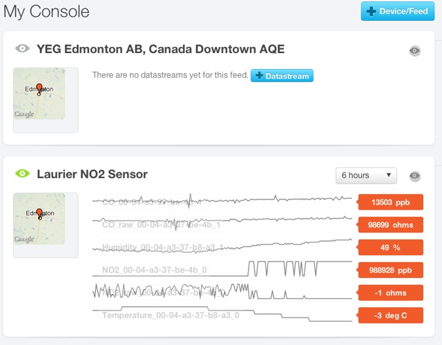
Dashboard or 'Console'
Finally, Cosm has provided a console interface to allow the user control over the data feeds that they follow, including API keys for each feed, and the ability to create apps. I have not yet explored the app feature to any extent, but I will report back when I do!
Finally, you can access and review the NO2, CO, Temperature and Humidity data that I am collecting from here.
Edmonton Population Density
Below is my first interactive map, published on the web! I used Map Box and Tile Mill technology to move from a CSV and Shape files to this map. The data came from data.edmonton.ca. Please explore and let me know what you think!
[mapbox layers='mattdance.Edmonton_Population_Density' api='' options='' lat='53.54079999999999' lon='-113.51039999999999' z='11' width='800' height='800']

What we DON'T know about smog in Edmonton.
As reported in the Edmonton Journal on 13 February 2013, Edmonton was under a week long air quality advisory due to elevated levels of particulate matter (PM), a constituant of smog. The smog was detected at two of the three AESRD stations in Edmonton - Edmonton East and Edmonton Central. From Alberta Health Services, here:
Precautionary air quality advisory lifted for city of Edmonton
February 13, 2013
EDMONTON– Alberta Health Services has lifted the precautionary air quality advisory issued February 6, 2013 for the city of Edmonton.
Monitoring indicates air quality in the city of Edmonton is no longer being impacted by the temporary air-inversion event.....
Information about the air quality in some areas of the Edmonton Zone is updated regularly on the Alberta Environment Air Quality Website:http://environment.alberta.ca/0977.html. Air quality information is also available by phone, toll-free, at 1-877-247-7333.
The reporting of this air quality event was thin in many respects. What causes smog in general, and what caused the smog in this specific event? How do we know the extent of the problem, and is there any way to identify the pollution sources that are contributing to the problem? I will attempt to answer these questions.
The USEPA defines smog as...
...a condition that develops when primary pollutants (oxides of nitrogen and volatile organic compounds created from fossil fuel combustion) interact under the influence of sunlight to produce a mixture of hundreds of different and hazardous chemicals known as secondary pollutants. Smog is the brownish haze that pollutes our air, particularly over cities in the summertime.
As indicated by the USEPA, smog is more commonly found in the summertime. In Edmonton, for the week of 06 - 13 February, a health advisory was called as a result of vehicle and other emissions being trapped under a temperature inversion, where the temperatures aloft are warmer than those on the ground. In this instance, the temperature inversion acted as a cap, not allowing the pollution to dissipate by wind. The Edmonton Journal article also indicated that the smog was a result of vehicle emissions. How widespread is the 'problem' of vehicle emissions, and how to we track them?
The following map of Edmonton does NOT depict air pollution. Rather, it indicates where some of the sources of air pollution are, and where the monitoring takes place that tracks these pollutants.
The Map: The black diamonds indicate industrial emissions sources from the NPRI database found within Edmonton. The white circles are the Alberta Environment run air monitoring stations, and the colour layer indicates density of traffic from the City of Edmonton open data catalogue where I ran an IDW analysis to define a 'topography' of traffic flow - the blue is no or low traffic density, yellow moderate and red high (the highest volumes of traffic are over 100 000 vehicles per day, and the lowest less than 50). Rail lines are dashed. I do not indicate other emissions sources such as light or moderate industrial activity that would not report under the NPRI.
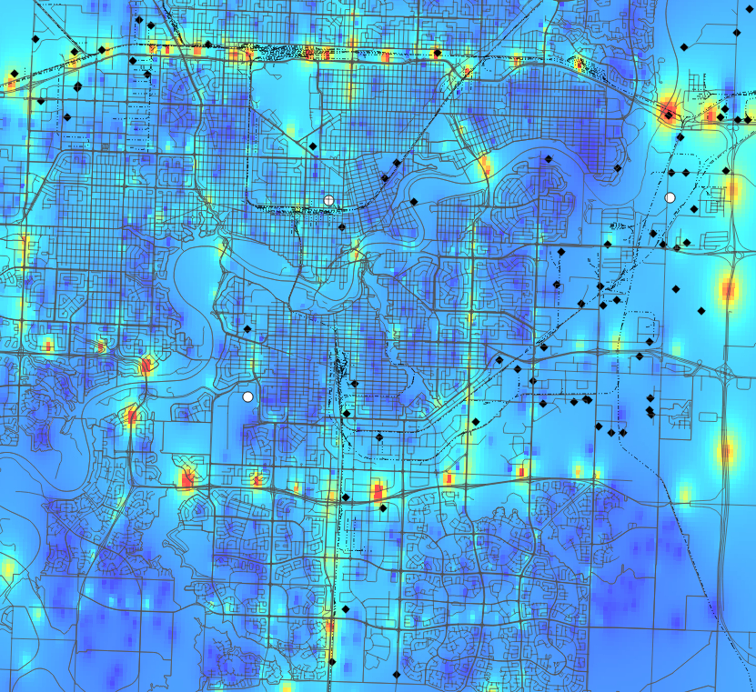
It is apparent from the map that there are many 'hotspots' of high vehicle flow, most notably on the Yellowhead, Whitemud and Henday. There are also some smaller pockets of high traffic flow in the downtown core, along 57th Street / Wayne Gretzky Drive, and Gateway BLVD. Environment's monitoring is located in the downtown, east Edmonton, and SW Edmonton. It is worth noting that the downtown monitoring station is on the top of a small building.
These regional monitors are great at pickup large are trends over time and are vital to the AQHI network, which is national in scope. There are three main issues with this AQ network: (1) it is limited in geographic area; (2) it is not at street level, and; (3) it is expensive to install and maintain.
So, we don't know the relative contributions of vehicle emissions vs other sources such as industrial or rail. We don't monitor or even really model in a public way vehicle emissions (The Clean Air Strategic Alliance, in 2007, released a ROVER report documenting vehicle emissions on Alberta roadways - the CASA link to the ROVER 2 report is broken, but I have a copy if you're interested), and so we cannot even speculate on the extent of smog pollution in Edmonton. This is a problem as the City of Edmonton becomes more urban, denser and bigger. How many cars can we add to the roadways, and how do we balance this with an appropriate amount of 'alternative' transportation options?
Where do accidents happen?
There is currently some debate in Edmonton regarding bike lanes, and the inconvenience that they will provide to drivers. In particular, Mayor Mandel was quoted as saying:
Not that they’re not a good idea, but it just seems someone behind your scenes out there has just decided we’re going to eliminate all vehicles and only have bikes.
In response, I wanted to look at the number of interactions that cars have with bike or pedestrian in Edmonton. The data.edmonton.ca portal had the appropriate data from 2010 - intersection collisions here, and midblock collisions here. I sorted the data for pedestrian and bicycle collisions with vehicles, and I included all data for bikes and pedestrians, regardless of who was deemed to be a fault. I loaded the CSV data into Cartographica, a lightweight Mac based desktop GIS, and used OpenStreetMap as the base layer for Edmonton. The results are below, captured as an image (I will work with someone more capable that me to check the data and to get it on line in an interactive format). Legend: red/yellow diamonds are intersection collisions, blue/blue diamonds are midblock collisions. The numer adjacent to each diamond represents an aggregate of pedestrian/bicycle interactions with motor vehicles. .

Some things to note:
- More collisions happen at intersections (90 in total) than midblock (22 in total).
- The most dangerous intersection in 2010 was Fort Road and 66 Street, with 4 collisions.
- The most dangerous stretches of road were Gateway BLVD north of 51 Ave, 109 Street north of Whyte, and Calgary Trail north of 34th Ave.
- Midblock collisions saw 18 pedestrians and 4 cyclists injured.
- Intersections saw 65 pedestrians and 27 cyclists injured.
Conclusions
There is a greater safety issue at intersections where advanced pedestrian and cyclist activated lights should be installed in conjunction with bike lanes. Furthermore, if the bike lanes are being considered for safety reasons, residential street speeds should be lowered from 50 km/hr to 30 km/hr. There is convincing data that cars travelling slower inflict less damage than tose travelling faster - see this WHO report [PDF].
Finally, if the City of Edmonton were serious here, they could conduct an interesting study to track accident rates with cyclists and pedestrians give the introduction of bike lanes, intersection controls and low residential speed limits.
Why I don't support mandatory helment laws.
Please skip to 4.0 Conclusion for the abridged version of this long post. 1.0 Introduction I wear a helmet when I bike, and cannot imagine cycling without one when either road riding, mountain biking or on a family ride. I am uncomfortable without a helmet and feel vulnerable to injury by cars and my own stupidity - I have fallen off my bike often enough to know that for me a helmet is probably a good idea. Furthermore, I am trying to instill this habit with my children; they always have a helmet on when they get onto any self propelled wheeled vehicle. To my mind, there is no downside to wearing a helmet as long as you cycle within your ability.
But, having said the above, I am not certain that mandatory helmet laws are effective in preventing head injuries. In fact, I wonder if the bicycle helmet debate distracts us from a harder discussion on road safety and risk. I think that it is easy to have a public debate about a fringe group of cyclists and how they should be safer, rather than focus on road safety which would include slower residential speed limits, impact road and urban design, and be more difficult to reach consensus. After all bike helmets save lives, right? I am not sure, and so I am looking to answer the following questions:
A. Do mandatory helmet laws prevent head injuries?
B. What are the consequences, intended or otherwise, of mandatory helmet laws?
C. Are there better ways to protect cyclists?
I am writing within context of Alberta, which has had a helmet law since May 2002 that applies to children under the age of 18. Furthermore, this is a first attempt at understanding a complex issue. Please help me understand you position, comment below!
Please note: I AM NOT ADVOCATING A BEHAVIOUR. I WEAR A HELMET, AND SO DO MY KIDS. YOU CHOOSE WHAT IS BEST FOR YOU!
2.0 Evidence Based Policy I don’t think that it is correct to assume that helmets save lives, just as I don’t believe that climate change is a hoax because it is −20C in Edmonton while I write this. Where there is a hypotheses related to policy, there should be a way of collecting data to test that hypotheses. In other words, good public policy is not made from individual cases, anecdote, or from a gut feeling, but rather should be made from a position of informed choice where all viable options and outcomes are examined through the lens of data analysis. The final policy choices may be made for political reasons, but at least these are informed decisions. Medicine is an example where evidence plays a big role in determining best practices. As discussed here, evidence based medicine (EBM) is the “…conscientious, explicit and judicious use of current best evidence in making decisions…”.
Every time (I hope, but perhaps this is a pipe dream) you go to an emergency department, see a medical specialist, or have a procedure done, you rely on this process to get the best results and safest treatment (otherwise you see a naturopath). Evidence based decision processes do not have to be limited to medicine, we can expect the same rigor for public policy, in general, and within the helmet debate specifically. To that end, I plan on examining the evidence that addresses my questions.
3.0 What does the data say? Three types of data should be considered when assessing whether cyclists, by law, should be required to wear helmets - (1) bicycle / vehicle collisions and (1a) bicycle incidents that are comprised of falls or collisions with stationary objects or other bikes, and (3) emergency room visits related to bicycling accidents. These data should be looked at within an Albertan and international perspective. To give a relative risk, pedestrian data will also be examined. Caveat: I don’t have total numbers of cyclists and pedestrians - so their is some interpretation going on here based on totals numbers.
3.1 Bike, pedestrian and vehicle interaction in Alberta The following data are taken from Alberta Traffic Collision Statistics 2010 (found here [PDF]) , and represent the number of incidents for 2010.
| Road User | Killed (N) | Killed (%) | Injured (N) | Injured (%) | Total (N) | Total (%) |
| Drivers | 185 | 53.8 | 11012 | 60.3 | 11197 | 60.2 |
| Passangers | 65 | 18.9 | 4528 | 24.8 | 4593 | 24.7 |
| Pedestrians | 35 | 10.2 | 1129 | 6.2 | 1164 | 6.3 |
| Motorcyclists | 31 | 9.0 | 683 | 3.7 | 714 | 3.8 |
| Bicyclists | 6 | 1.7 | 467 | 2.5 | 467 | 2.5 |
| Other | 22 | 6.4 | 450 | 2.4 | 462 | 2.5 |
| Total | 344 | 100 | 18253 | 100 | 18597 | 100 |
These data were copied from Table 3.1 of the Alberta Traffic Collision Statistics, 2010
3.1.1 Observations I am surprised that more pedestrians were killed and injured than bicyclists in 2010. 1164 pedestrians (6.3% of the total) as compared to 467 bicyclists (or 2.5% of the total). These are interesting numbers, but not really relevant unless we know the total number of pedestrians in Alberta vs. bicyclists. Or even better, the total number of kilometers walked by pedestrians vs. the total number of kilometers cycled by bicyclist. In this latter case, we could then calculate injuries and deaths per kilometer travelled for each case. It would also be interesting to factor motorcycles into this mix. A side note. The raw numbers clearly indicate that about 2.5 times more pedestrians were killed than cyclists in 2010 and yet no one is suggesting that pedestrians wear helmets.
3.1.2 Other observations from the Traffic Collision 2010 report From the same report, Table 9.4 indicates that “Casualty rates per 10 000 population were highest for persons between the ages of 15 and 19”. The lowest rates were for those under 5 and over 55. 27.1% of bike accidents due to the cyclist disobeying a traffic signal, and 13.5% due to the cyclist failing to yield the right of way at an uncontrolled intersection.
From Table 9.3, 9.2 and 9.1 - most accidents occurred on weekdays between 3 − 7PM (rush hour), in June. From Section 8 of the report; Pedestrians faced the similar hazards, with most vehicle, pedestrian interactions occurring during rush hour, in October. It is interesting to note the language of the report points to the actions of the drivers being responsible for pedestrian injury (rather than pedestrians being responsible for their own injury) or death, versus the action of the bicyclist being responsible for their own injury or death.
3.2 Cycling rates and ER admittance The section will draw upon a PhD thesis, from the University of Alberta, written by Mohammad Karhaneh in 2011. Commentary and insight on this thesis was found here. . Karhaneh notes the following based on pre- and post-law observational studies completed in 2006:
- There was a large decrease, 56%, in children’s cycling from 2000 to 2006.
- There was also a decrease in teenage (13-17YO) cycling at 27%
- A 21% increase in cycling for adults.
In his dissertation, Karhaneh simply notes a decease in the number of people seen in the ER as a result of cycling injury. He does not create a ratio of cycling injury to the number or rate of cycling in the population (from cyclehelmets.org). In contrast to the decline in cycling, the rate of injury seems to have gone up after a mandatory helmet law was legislated. As cyclinghelmets.org notes:
“The number of children treated in emergency rooms for non-head injuries was an average of 1,762 per year in 2003-6 compared with 1,676 in 1999-2002, despite there having been a fall of 56% in children cycling over the period. For teenagers the average number of injuries rose from 870 to 1,101 per year while the amount of cycling went down by 27%.”
4.0 Conclusion
This is a complex issue that involves many factors, and I have only offered a slice of the available data, with some commentary that makes sense to me provided by cyclehelmets.org. I have not touched on most of the available data, nor have I explored the physical limits of helmets as protective equipment (see here [PDF] for an overview). I have also neglected to look at injury rates in other jurisdictions that have slower residential speed limits, dedicated cycling lanes and a stronger bike culture. I could complete a PhD on this question, and in fact some have - perhaps this complexity and depth of information is a barrier.
To summarize, it seems that helmets are of use for a limited population in certain circumstances, as in children cycling at slower speeds who fall a shorter distance onto smooth ground. As soon as the speeds increase, and the falls become more complex (uneven ground, impacts with other moving objects such as cars, etc.), the protective benefits of a helmet are negated. Male children 15 - 19 seem to be the most at risk of injury - the data indicates that they are, as a population, more reckless, and take greater risks beyond the capacity of a helmet to manage. In fact, it is speculated, that if they were not wearing a helmet, that 15-19 YO males might not take so many risks. In other words, the helmet was perceived to offer more protection than it does. This finding can be extrapolated more widely to account for the general increase in head injury found in Alberta AFTER the introduction of bike helmet laws. People take more risks when they think they are protected + the limited protection afforded by a helment = more cycling injuries.
I also got the sense from the data that a culture of cycling was protective against injury for those who commute. Dedicated bike lanes, more bikes on the road and drivers who were more aware seems to make roadways safer. I also wonder about residential speed limits for overall road safety. What if we were limited to 30KM/HR rather than 50?
Finally, the data also seems to indicate that the perception of cycling as a dangerous activity dissuades people from riding, leading to two unfortunate outcomes: (1) those who do not cycle, don't gain the health benefits, and this could be significant given increases in obesity, and; (2) spontaneous Bixi Bike type trips are less likely to happen in those jurisdictions that have helmet laws.
“In general the rate of head injuries is declining, but this is not consistent across the country, nor is it attributable to legislation as some provinces with legislation experienced a decline while others did not.” Middaugh-Bonney T, Pike I, Brussoni M, Piedt S, Macpherson A, 2010. Bicycle-related head injury rate in Canada over the past 10 years. Injury Prevention 2010;16:A228.
AQ Egg: First impressions
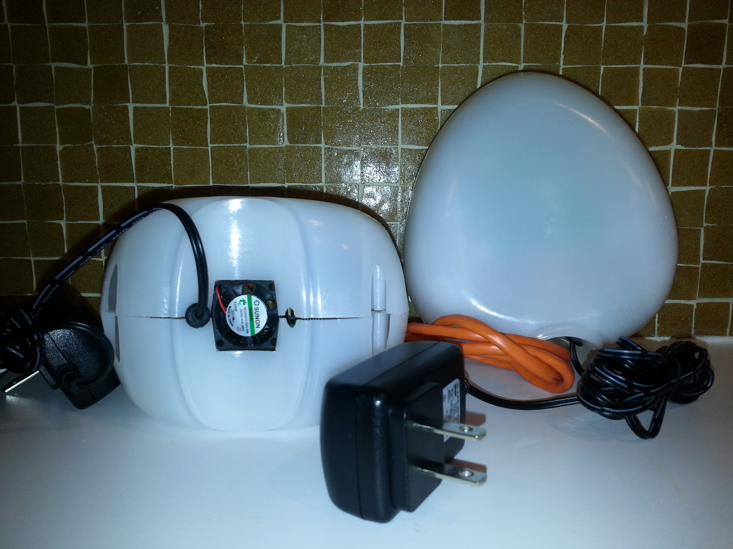 My Kickstarter contribution has finally paid off! My Air Quality Egg has arrived in the mail! To recap, the AQ Egg over-reached its funding goal in April 2012. The project had asked for $39 000.00, and raised over $144 000.00 with 927 backers. Impressive. And scary. As we soon learned, their were high expectation, and the egg almost hatched as vapour-ware (an impressive timeline can be found here). In short, what was promised in July 2012, was shipped in January 2013. What shipped, sadly, is not what I had expected.
Given the extra time that was used to create the egg, I was disappointed at how 'cheap' and flimsy it felt. In removing it from the shipping box, the sensor pictured at the base of the left egg became loose and fell out. The egg, which is 'snapped' together via a vertical seam that runs around the device, was not properly 'snapped'. It was loose and I was able to easily pull the shell apart. Furthermore, when reading the directions on how to set the sensor up, I was surprised to learn that they shipped some of the eggs, and unknown numer of them, with a software bug (the details here).
My Kickstarter contribution has finally paid off! My Air Quality Egg has arrived in the mail! To recap, the AQ Egg over-reached its funding goal in April 2012. The project had asked for $39 000.00, and raised over $144 000.00 with 927 backers. Impressive. And scary. As we soon learned, their were high expectation, and the egg almost hatched as vapour-ware (an impressive timeline can be found here). In short, what was promised in July 2012, was shipped in January 2013. What shipped, sadly, is not what I had expected.
Given the extra time that was used to create the egg, I was disappointed at how 'cheap' and flimsy it felt. In removing it from the shipping box, the sensor pictured at the base of the left egg became loose and fell out. The egg, which is 'snapped' together via a vertical seam that runs around the device, was not properly 'snapped'. It was loose and I was able to easily pull the shell apart. Furthermore, when reading the directions on how to set the sensor up, I was surprised to learn that they shipped some of the eggs, and unknown numer of them, with a software bug (the details here).
Needless to say, these are annoying details.
But, I am still a fan. While the NO2 sensor is not sensitive enough to pick up all but the highest spikes in NO2 (that we know as no one has consistently monitored busy roadways in Edmonton), it feels cheap, and it arrived months late, it still represents a remarkable revolution. No other AQ sensor offers such easy and inexpensive citizen access to AQ monitoring. Granted, you have to be rich and technically literate to deploy one of these things, but it is a step away from government controlled monitoring. It is possible to build or purchase at a low cost, and it is complete open sourced. In other words, you can download a component list, 3D printing schematics, and the code to build and launch your own sensor. I have to remember that I received a V.1, and as with many V.1, there are issues. But these issues will get ironed out in successive iterations as more people look at, and improve upon, the egg.
You can learn more about the Air Quality Egg here , and you can view my (empty for now) data stream here. I'll update this when I have my egg feeding data to the web.
Job Posting - Contract coder
Thesis Musings
The Point
I just completed my MA in Human Geography. My research pertained to people's understanding of location and their communication of that understanding through emerging location based technologies. My entire thesis can be access here (be warned, it is a large PDF via Google Drive).
In an effort at transparency, the next series of blog posts will examine some of the data that I collected pertaining to place and space, and the communication of that understanding through the tools of neogeography. These posts will draw upon two sources of data; mental maps that my research cohort drew, in conjunction with descriptions of the places represented in their mental maps. I will start by framing the discussion with place, space and mapping concepts.
Please note: The University of Alberta’s Arts, Science, and Law Research Ethics Board granted permission for me to post sections of interview transcripts to personal blogs, as did each informant. Any names that are referenced are pseudonyms.
Place and Space
The notion of 'place' is a common descriptor of the world, and is a central theme in the study of geography (Relph 1976) and other social sciences such as sociology and psychology (Gieryn 2000). These various disciplines characterize and describe place in a variety of ways (Harrison 1996); for the purpose of this study, place is defined as being comprised of three dimensions (after Relph, 1976):
- Observable activities that occur in relation to the place
- The meanings that are created by a person in that location, and;
- The physical features that comprise the location's concrete or tangible attributes.
A place is comprised of its physical characteristics, the activities that occur there and the meanings derived thereof (Devine-Wright 1997). The more familiar a person is with a place, through experience (for instance, through recreational or sporting activities), the greater the meaning that place is likely to have (Lynch 1995).
Maps
Maps are a common metaphor used to describe place (Zook 2007) where simple points on the map represent a much more complex reality. Lynch (1960) views place as a series of connected locations where individuals mentally organize their spatial environment in predictable ways around five elements (see below). Lynch's view of place implies that linkages exist between places based on a person's experience with those locations, creating a tapestry of meaning imposed upon an urban landscape. Similarly, (Tuan 1977) differentiates place from space based on the familiarity a person might have of the former; as a space becomes more familiar, more intimately known, it is transformed into a place. `If space is movement, then place is pause' (Tuan 1977, p.6).
Maps are one tangible way of conceptualizing and representing place and space. Modern maps, such as atlas and road maps, are mass-produced for a consumer market, and are the result of painstaking work done by experts in the fields of cartography, air photo interpretation, statistics, and other disciplines. One of the goals of a modern map is to communicate an objective representation of place that is accurate, useful and that conveys a sense of that place (Taylor 2009). For instance, a map of a city may convey a sense of place by rendering a collection of place names (buildings, roads, plazas, etc) overlaid on a road network, on top of topographic features.
While a map-reader may get a sense of that place, via those representations, the map does not convey the deeper understanding of place that comes from everyday experience, meanings and associations that a resident may possess. In fact, maps may distort a local knowledge by misrepresenting the meaning of place as reflected by, for instance, place names (Frank 2000). In this instance, expert knowledge of map-making is not enough to produce maps that convey an accurate sense of place. The missing ingredient is the experience of a place that can only be gleaned by visiting, or perhaps by interacting with someone who has intimate knowledge of it.
One outcome of this central and authoritative communication of place, via consumer maps, is that citizens are relegated to the role of consumers to be consulted by experts (i.e. urban planners, academics) in their quest to understand what a place means to people. Tools such as cognitive mapping (Kitchen 2009) and mental maps (Lynch 1960) are traditionally utilized to mine these location data from individuals. Tversky (1993) defines cognitive mapping as the process of mentally acquiring, storing, recalling, and decoding metric information relative to location. Mental mapping is the non-metric capture of spatial relations among elements, allowing reorientation, spatial inference and perspective taking (Downs 1977). The importance of these concepts is that they rely on an individual's non-expert or lay, understanding of space. Indeed, the academic notion of Naïve Geography (Egenhofer 1995) is predicated on a `common sense' understanding of geography, where the focus is largely on the non-expert.
The descriptions of place gleaned from the cognitive, mental or naïve are the result of an individual process of understanding. While there are shared map elements between people (e.g. most people will recognize a 'cross' as being the location of a church on a map), these shared elements do not represent a shared experience or the basis of a common understanding within a community. Within this context, there are a variety of ways that an individual or community can understand place, maps being one.
References
Devine-Wright, P. and Lyons, E.: 1997, Remembering Pasts and Representing Places: The Construction of National Identities in Ireland, Journal of Environmental Psychology 17, 33–45.
Downs, R. M. and Stea, D.: 1977, Maps in Minds. Reflections of Cognitive Mapping., Harper and Row.
Egenhofer, M. J. and Mark, D. M.: 1995, Naive Geography, in A. Frank and W. Kuhn (eds), Spatial Information Theory: A Theoretical Basis for GIS, International Conference COSIT ’95, Vol. 988 of Lecture Notes in Computer Science, Springer, Semmering, Austria, pp. 1–15.
Gieryn, T.: 2000, A Space for Place in Sociology, Annual Review of Sociology 26, 463–496.
Harrison, S. and Dourish, P.: 1996, Re-place-ing Space: The Roles of Place and Space in Collaborative Systems, Proceedings of the 1996 ACM conference on Computer Supported Cooperative Work, CSCW ’96, ACM, New York, NY, USA, pp. 67–76.
Kitchen, R. M.: 1994, Cognitive Maps: What they are and why we study them?, Journal of Environmental Psychology 14(1), 1–19.
Lynch, K.: 1960, The Image of the City, The MIT Press.
Lynch, K., Banerjee, T. and Southworth, M.: 1995, City Sense and City Design: Writings and Projects of Kevin Lynch, MIT Press.
Relph, E.: 1976, Place and Placelessness, Pion.
Tuan, Y.: 1977, Place and Space: The Perspective of Experience, University of Minnesota Press.
Tversky, B.: 1993, Cognitive Maps, Cognitive Collages, and Spatial Mental Models, in A. U. Frank and I. Campari (eds), Spatial Information Theory: A Theoretical Basis for GIS, Proceedings COSIT ’93, Vol. Lecture Notes in
Computer Science, Springer: Berlin, pp. 14–24.
Zook, M. A. and Graham, M.: 2007, Mapping Digiplace: Geocoded Internet Data and the Representation of Place, Environment and Planning B 34(3), 466–482.
Under Development
I am sorry about the mess presented here, but I am concurrently updating my site and learning Wordpress! Please have a look and let me know what you think!
images of our city: ezio farone park
 Everyone knows Ezio Farone Park. Its the park at the top of the stairs adjacent to the Glenora Club, and is a node between the southside and downtown; the top of the bank with the river valley. I lived for years at 100 Avenue and 110 Street and love how cycling and pedestrian traffic flows north / south through Ezio. On winter days while walking down to the Kinsmen, I could feel the temperature drop as I descended down the stairs into the River Valley.
Ezio Farone park is named after Constable Ezio Farone, a member of the Edmonton Police Service who was killed in action on June 25th, 1990 (from Crime and Punishment website here). While the park is lauded by the running and stair walking community, it is more than just a stairway to fitness heaven. Ezio Farone is a hub of transportation and offer some of the best views of the River Valley, the University and the High Level Bridge. Just check out a Flickr Search to see the great views offered by the park. Furthermore, Ezio provides the best vantage point for the Canada Dat fireworks, as is evident from Flickr.
But, more importantly, Ezio's place in Edmonton is based on several design choices that I think work in the park's favour. The park flows north to access points at (1) 110 street, (2) to the bike trail that parallels 109 street, and; (3) pedestrians can walk up 111 street.

The central part of the park has a few paved trails that connect with the High Level Bridge, stairs adjacent to the Glenora Club, and paved paths that run to the west adjacent to the Victoria Golf Course. It is a true urban park offering great access and is used by people seeking exercise (boot camps, stair running), strolling or simply sitting around. Walking up 100 street offeres access to one of the heritage communities in Edmonton, and to the Grandon LRT station.
Up on the right near the Copper Pot restaurant stands a parkaide next to a hight rise building. A section of the parkaide is distinguished because it is constructed out of clinker brink, by Peter and Olga Figol. Clinker brick is baked at a very high temperature rendering the bricks denser and less pores that normal bricks, they also represent an 'Arts & Crafts' style. Clinker bricks are not used as building materials, and are rarely seen in Edmonton.


The escalators from track level to the Grandin Station feel deep and steep, and when you emerge from the tunnel on a summers day, you are met by tall mature trees and an urban environment that is saturated with green space . This community, part of Oliver, flows well from the River Valley, through Ezio Farone and connects with Jasper Ave a few blocks to the north. Groceries, local and chain coffee shops and cloths shopping are all accessible within a short walk. While each of these elements on its own is not remarkable, in combination they allow this community to shine.
Urban GeoWeb 2
Health applications and data are becoming a greater part of the GeoWeb as more people start working with aggregated data sets to look for trends. of course, MIT is exerting some influence in this domain with their Health Infoscape project. From the project website:
Health InfoScape from MIT Senseable Cities and GE aims to create new ways of understanding human health in the United States. By analyzing data from over 7.2 million anonymized electronic medical records, taken from across the country, we are seeking to uncover statical relationships between space, geography and health.We often have a tendency to think of illness as an isolated event, but our first analysis details the numerous (sometimes unexpected) associations that exist around any given condition. This gives us new insight as to how closely connected some seemingly un-related health conditions might be. Such results force us to re-examine conventional categories of disease classification, as the boundaries between traditional disease categories are thoroughly blurred.
Another big player in the GeoWeb domain is UCLA, with their URBANSENSING project, their vision:
We see a future in which we - individuals, neighbors, friends, and relatives - can use the technology around us to observe, discover, and act on the patterns that shape our lives. Whether your passion is personal or global, whether your interest is in health or the environment, whether you act alone or in a group, Urban Sensing is a new approach that empowers all of us to illuminate and change the world around us.
Within this context, there are two project that I think are particularly excellent: (1) Personalized Estimates of Environmental Exposure and Impact (PEIR), and; (2) Cycle Sense. PEIR seeks to document your environmental exposure within four categories - smog and fast food exposure, carbon impact and your impact on sensitive sites such as schools. This is accomplished through the use of location-based tech installed on your mobile devise.
Cycle Sense provide cyclists with current feedback on the quality and safety of the bike routes, and suggest modifications based on the time of day. This is accomplished within a larger community of cyclists who provide feedback by loggin their bike routes, and by providing geotagged annotations augmented by automatic sensor data common to many smart phones (sound, accelerometer) that can infer road roughness and traffic density.