Open Data Day 2015 (#ODD2015)

It is only fitting that the Edmonton's Public Library host the ODD2015 Hackathon (on 21 February 2015), as the Library stands for three of the main themes of this years hack, and events leading up to that hack: (1) Inclusion; (2) Civic Engagement, and; (3) Literacy.

Inclusion

The Edmonton Public Library is a space held in trust for all of Edmonton's citizens. It provides equal access, and does't care which community you belong to, or how you self identify. To reflect this level of inclusion, and to push back on the culture of exclusion seen in so many tech industries (think GamerGate and Open Street Map), the #ODD2015 Hackathon is instituting the following Hacking Code of Conduct:

Our hackathon is dedicated to providing a harassment-free experience for everyone, regardless of gender, age, sexual orientation, disability, physical appearance, body size, race, ethnicity, nationality, religion, previous hackday attendance or computing experience (or lack of any of the aforementioned). We do not tolerate harassment of hackathon participants in any form. Sexual language and imagery is not appropriate at any hackathon venue, including hacks, talks, workshops, parties, social media and other online media. Hackathon participants violating these rules may be sanctioned or expelled from the hackathon without a refund (if applicable) at the discretion of the hackathon organisers.

Civic Engagement

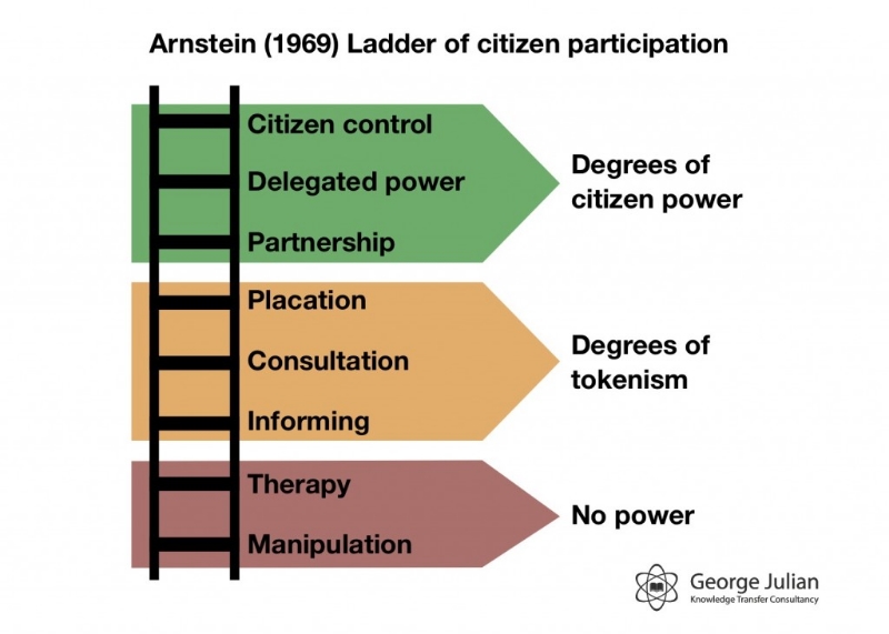
Arnstein's Ladder of Citizen Participation describes the relationship between government and citizens. At the bottom of the ladder, citizens are manipulated and have no power.  At the top of the ladder, citizens and governments are indistinguishable.  While I would not hazard to guess where we sit relative to the City of Edmonton or the Government of Alberta, I do know that Open Data and hacking serves to move citizens up the ladder.

As we learn to use the tools hacking, and by this I don't just mean coding, but other tools such as data scraping, design, networking & outreach, generally organizing around the building of something, we are more engaged with each other and more likely to push back against government policy.

In the best case, we are provided the data with which governments make decisions such that we can draw our own conclusions.

Remember:

Real change comes from the bottom up. Innovation occurs at the interface of diverse minds and perspectives. Collaboration is hard. It requires stepping beyond comfort, into the unfamiliar. It’s worth it.

Literacy

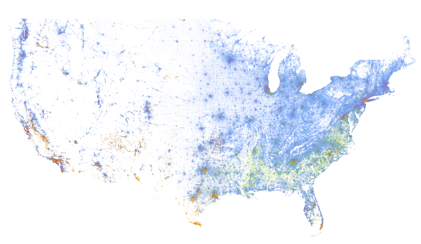
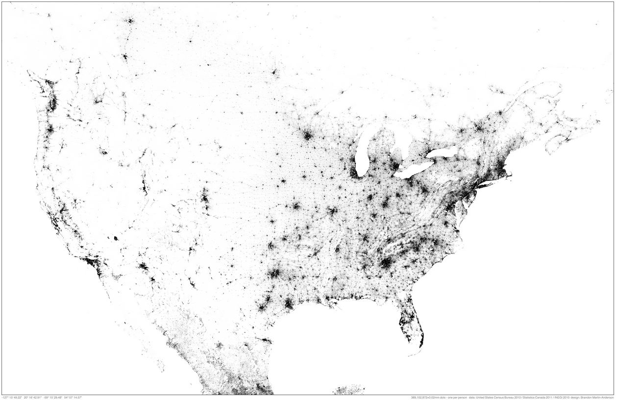
Finally, libraries are all about literacy. And so are Hackathons; only it's call numeracy in the data context. If you learn one thing at a Hackathon, it should be not to be afraid of data, and don't worry, because you can't break it.  Play with the data, and start exploring how to use your spreadsheet.  If your an expert at Excel, download QGIS and start playing with an open source and free GIS.  Think about the data, and the stories it might tell, and how it might address your frustrations with the Government process.

Resources

Finding a place in tech without writing a line of code.

Open data resources from Canada and around the world

Datalibre.ca: A blog which believes all levels of Canadian governments should make civic information and data accessible at no cost in open formats to their citizens.

Map school offers an introduction to maps and map making.

The Elements of User Experience describes the design process to build good software.  There is a lot of non-code that goes into software, and this website/sample chapter provides good insight.

Open Data Tools offers a range of tools to help understand the open data sets that you may be working with.

I use AimerSoft PDF Converter Pro, in conjunction with ScanSnap to convert either paper or PDFs to excel data tables.

Parking in Edmonton

This is a great example of how you can use opendata, coupled with an interactive map platform and some FOSS GIS tools, to create a deeper understanding of landuse within a dowtown core. In this instance, I've created a map of Downtown Edmonton that includes building footprints, parking surfaces and trees. You can zoom into the map to take a closer look at the tree density, and by zooming out it's possible to see the amount of land dedicated to parking.

To take this map further, it would be pretty easy (though potentially very time consuming) to calculate the land area for each land use tyope, including surface lots. It is even possible to calculate an approximate surface area for the roadways, and thus calculate the percent of landuse dedicated to cars.

The data I used in this instance is from Open Street Map's Metro Extracts for the building outlines (although the City of Edmonton has just released an updated and better roofline dataset). The surface lots I hand drew in QGIS, and the tree data are from data.edmonton.ca.

VGI Map Progress

Progress on the VGI map

The broad goal of this project is to create a scalable, easy to deploy map that enables user input of point, line and polygon into a DB that supports some level of moderation. In addition, the UI will support layer control, pan and zoom. While these elements are available though the Leaflet JS library (and it only makes sense to use this library) there isn't a "ready to deploy" iteration of this build for someone who cannot code in JS. As such, I think that there is a need for researchers, or PPGIS geeks like me. Please see below for a stack concept.

VGI Stack Concept
VGI Stack Concept

Within this context, I am asking for help from the broader developer community, and specifically those geonerds with the right skills, by way of GitHub. I have created a VGI Project repo on GitHub with some project parameters, wireframes and a base template (shamelessly stolen from CartoDB), and I will be working with Zachary Schoenberger to fill out more details. My plea:

  1. Help with the project parameters and management;
  2. Poke holes and generally make suggestions on what can be better;
  3. Contribute code.

What do you think?

Building a VGI Web Map 1: Goal and workplan

It's clear from my previous two posts that I want to learn how to build a web map. So, this post to lay out my roadmap forward.

Outcome

Front end: A beautiful web-map with an intuitive UI, layer controls and the ability for a user to add point, line and polygon features, and to describe those features.

Back end: Upload and display data via layers on the map, moderation controls, make selected data 'private', download the spatial data (+ meta data) in a GIS friendly format such as .shp or .geojson.

Map Models

I am modeling my outcome on the look, feel and function of two maps:

Calgary Flood Map

salish sea spill map

The Tech

After some discussion and a great email from Hugh Stimson where he explained the components, and range of options he considered to build his Salish Sea Spill Map, I think I have a way forward - my specific project needs include:

Database:  The options for this include CartoDB, Fusion Tables and MySQL or PostGIS.  I think that I have settled on CartoDB as a middle road - perhaps a little harder to learn than Fusion Tables, but with some more functionality (i.e. I understand that the logic of CartoDB can include moderation by 'queuing' the VGI content for approval by a moderator).  I am learning PostGIS as the standard DB, but find it frustrating and will switch over if I get good enough to manage it.

Base Map: I have not settled on this yet, but think that I will use a simple OSM derivative map, something like the MapBox Streets or Stamen Toner. The point of this base-map is to provide enough geographic detail that (1) the additional layers of data make sense, and (2) so that a VGI contributor can select the correct geographic area in which to add their data.

User Interface:  There are a range of functions that need to be accommodated, which include:

  • Zoom control
  • Layer control
  • Dialog boxes
  • Navigation bar
  • Forms (and perhaps some form validation)
  • VGI Input

To do this, I think we will need to run Bootstrap and Leaflet, but I am not certain and need to delve into this in greater detail.

The final configuration will be CartoDB + Leaflet + JS.

The Plan

  1. Consult with my team to ensure my thinking is correct, and to rough out a more detailed requirements list.
  2. Start using CartDB and Leaflet to build a basic web map as a prototype
  3. Build this basic map out until I meet the requirements.

The Plan B

Deploy a 'personal' instance of Ushahidi if Plan A takes to long or is simply beyond my skill.

Conclusion

I plan on regular updates to document my progress and to ask for help. If you are reading this, and are interested in contributing some skill, time, or simply advice, please let me know by email or twitter. I can't pay you, but I will buy you coffee, maybe lunch and, if you build something, will defiantly give you credit on the map.

uMap Test Deployment

I am testing uMap to see if it may work for the purpose of crowdsourcing spatial data. Please have a look and add some content:

uMap looked promising.  I loved that it supported some map customization (i.e. the Stamen Toner or the OSM monochrome map theme) and that the interface for adding point, line and polygon was intuitive.  I did not see any moderation tools, but was interested in the embed function... so I tried it.  Not impressed.  A map in a WP post, I can zoom but not add any VGI. This will not work for my purpose.

NOTE: 30 October 2015.  uMap was not quickly connecting to it's servers, which was slowing down by blog load time. As such, I removed all links to uMap.

VGI GeoStack - Some Questions

I am working on a mapping project where, once deployed, we will be looking to gather VGI or crowdsourced geographic information from a specific group of Edmontonians.  Ethical issues aside (I am looking at Matt Wilson's Critical GIS Reading List) I am trying to get my head around the technology that I will need to deploy to enable a customizable, flexible and light stack for displaying a number of map layers, and collecting point, line and polygon data as well as a narrative that may accompany these spatial data.  I considered a deployment of Ushahidi's Crowdmap, but feel that it does not offer the speed and UI / UX flexibility that we need. The stack I am considering, and would like feedback and suggestion on, is:

  • PostGIS as the database
  • QGIS + TileMill – to process and style the base-map and layers, and to make the MBTiles.
  • PHP Tile Server – To serve the MBTiles onto the internet.
  • Leaflet JS – for the UI/UX design
  • OSM's iD Editor - for the VGI component to manage the contribution of spatial data.

I have some questions regarding this:

  1. Is this the best / easiest way to go?
  2. Can the iD Editor be linked to PostGIS, or is there a better way in this instance to glean VGI?
  3. What role can GeoJSON and GitHub play in this stack?

I am still getting my head around this and would appreciate any thoughts.

UPDATE 02 December 2013

I received some good discussion and suggestions for a platform via Twitter from Alan McConchie and Hugh Stimson (Hugh pointed to his Salish Sea Spill Map as a map that incorporates VGI - it's an interesting project and cool map):

twitter_chat

I plan on breaking down both uMap and MapStory, and will update this post again with my results.

uMap Update on 03 December can be found here.


QGIS, TileMill and MapBox, oh my. Or, web mapping tools I am learning to use.

How do you make a web map?  

This is the question I have been exploring for the past while as I try to expand my basic knowledge of GIS beyond the ARC.  As a result of this exploration, I have put a few maps on-line, developed a keen passion for map making and an interest in expanding my skills.  This post comprises a list of my mapping tools - those I currently use, those I am actively learning, and those on my list to learn. The geo-stack that I am working toward comprises of the following:

  • PostGIS - works as the spatial database for storing and serving the data to either QGIS or TileMill
  • QGIS + TileMill - QGIS is a great tool for analyzing and processing data, TileMill makes it look good and allows an export of MBTiles.
  • PHP Tile Server - This serves the MBTiles onto the internet.
  • Leaflet JS - Leaflet provides the user interface allowing someone on-line to interact with the MBTiles.

While I am learning the components of this stack, I use other things, described below.

Web mapping tools I use

Open DataOpen data forms the basis for most of my base map data. Open Street Map extracts allows me to build interesting, complete and free base maps, and various open data portals offer data for mashing. My goto data portals are:

OpenStreetMap - I am a minor contributor to OSM, and mainly use it as a database for urban, Edmonton, data.  For instance, an ongoing project is to classify each building by type (apartment, commercial, etc) in downtown Edmonton so that I can update my DTYEG map and create an accurate land use map of #yegdt. Cartographica - I mainly use Cartographica as a desktop geocoder, quick and dirty data viz tool.  I love how simple it is to dump data into the view window, and how quick it renders large data sets.  It is a light and easy way to quickly get a sense of a dataset, plus it has a 'live' map feed of OpenStreetMap or Bing. It can import or export to KML, and complete some lightweight data analysis like heat maps. QGIS - Where Cartographica is light, QGIS is robust.  A free way to get a full GIS on your desktop, and because I run an iMac, the easiest way to do spatial analysis without loading a Windows VM (and much cheaper too, as in free).  I love QGIS, but it requires a set of skills comparable to those used in ArcGIS.  I am still building this skill set. TileMill - TileMill is awesome. A super easy to use map style machine by MapBox, TileMill uses CartoCSS (Cartographic Cascading Style Sheets) to code the look of each point, line, polygon and raster within your map.  It renders maps fast and beautiful, and dumps them in a variety of formats, including MBTiles, which you can then load onto the MapBox site for a fully interactive map experience. MapBox - MapBox provides two services that I find vital - (1) web hosting and (2) base maps that can be styled. I am not yet skilled enough to take the MBTimes and put them online myself, so I rely on a MapBox subscription to host my maps.  If I am working with a large geographic area, and am not yet skilled at dealing with huge data sets, so I also use MapBox's base map, from OSM, which can be made custom. Also, MapBox provides some great satellite imagery as a base map, and an awesome blog on what is new in mapping.

Web mapping tools I am learning

PostGIS - I learned recently that the cool kids pronounce this as Poist-jis NOT Post G-I-S.  PostJis is hard and I don't really get it - it is a OSS project that adds support to geographic data within a PostSQL database.  I have been working with a Refractions Research tutorial, and have been able to install PostgreSQL and enable PostGIS, but I am unfamiliar with SQL so I find it hard even knowing how to compose a command.  Lots to learn here.  My PostGIS resources include:

CartoDB - I love how CartoDB makes temporal data come alive.  Check out this map of '7 Years of Tornado Data', and how you can almost pick out the season by the amount of tornado activity.  Apparently you can style the map in CartCSS (which I can do), combine various data sets, and run SQL queries.  Much to learn. Leaflet JS - "Leaflet is a modern open-source JavaScript library for mobile-friendly interactive maps". It's a UI that enables the user to interact with the MBTiles like: MBTiles > PHP Tile Server > Leaflet > User.

Web mapping tools I want to learn

Below I list a bunch of tools that I want to learn, but an still coming to grips as to what they do, and how they interact.  For instance,  I can picture the workflow of data from PostGIS to TileMill to MapBox, but I cannot picture the workflow from TileMill (MBTile output) to PHP Tile Server, and the role that JavaScript and HTML play in the creation of a hosted map (ok, I kinda get it, but not in a concrete, I have done this way). If I get anything wrong here (or anywhere in the post) please let me know - also, if I am missing a great resource, make a note of it in the comments. PHP Tile Server - PHP Tile Server translates the MBTile file onto the web and acts as an interface between the MBTiles and an UI such as Leaflet JS or even Google Maps. HTML - HTML provides the backbone of every website.  Learning to code HTML would simply allow me to create and style the webpage that my MBTiles are displayed upon. JavaScript - Like HTMP, JS is a programming langauge the provide some sort of function to a website.  Where HTML is static, JS is dynamic allowing the user to interact with elements of the website.  For instance, in a mapping context, JS would allow me to define a set of layers that a user could turn off and on to expose of hide specific types of data on a map.  Plan Your Place has a great interactive flood map of Calgary that illustrates this function.

GeoJSon - A JS derivative  (as is TopoJSon) of JS that codes spatial data such as point, line, polygon.  In the web mapping context it is a much more powerful format than ESRI Shape Files as it is lighter (i.e. quicker) and can be integrated into the code of the map.

Resources

This is not a complete list - in fact it is barely a list.  Please add a comment to point out what I am missing.

  • Code Academy - A free on-line coding tutorial that is interactive and problem based.  They offer tutorials for JavaScript, HTML, PHP and help you learn how to build web projects.  Very cool and free.
  • GitHub Learn GeoJson - GitHub is a place where programmers, especially those working on the OSS space, keep their code for others to download, use and improve upon. This is made by Lyzi Diamond.
  • Maptime! - An awesome list of mapping resources by Alan  McConchie (@almccon) and Matthew McKenna (@mpmckenna8).
  • Spatial Analysis On-line - As I try to remember my GIS courses, this is the on-line text that I reference to help me understand the analysis I want to run.
  • Mapschool - Tom MacWright wrote this as a crash course in mapping for developers.

Colour and Maps

These are the colour palette websites that I reference:

Finally, NASA has a great 6 part series on colour theory called the "Subtleties of Color".

Global Winds

A portrait of global winds. From NASA As high quality, high resolution satellite images become ubiquitous, maps such as NASA's global wind patters will become more common.  As a result, you will become used to looking at beautiful satellite base maps, don't forget just how special and rare these were.  An indication of the future satellite images can be found on the MapBox blog (and another cool post on the MapBox blog).

Edmonton's Residential Development Permit Process is Broken

  The object in question - expanding the garage 1.5m to the north, and attaching it to the house.

The City of Edmonton's residential development application process is broken.  I had a horrible experience that could have been much easier, less time consuming and a lot less costly.  Here is my story, the issues that I have with the process and some thoughts on how to improve the process.

The project

Our project was to add 10 square meters to the north portion of the garage, and in the process fill the 1.51m gap between the house and the garage.  A window on the south side of the house would have to be moved, as well as a so called 'man door' on the north side of the garage.  It's a relatively simple project, and I thought an easy ask of the City.  Because I have a background in geography (and could not find someone to do the drawings), and have done many to-scale drawings in the past, I decided to do the following myself, which I put together in a 13 page PDF:

  • A rationale and justification for the project
  • A site plan (from the RPR)
  • A floor plan
  • A south and west elevation

The PDF also included 12 photographs of the houses on the blocks to the east and west documenting that an attached garage was normal for this neighbourhood. I also addressed the concerns raised in the City of Edmonton's Mature Neighbourhood Overlay. Specifically:

  • A variance was identified in that the garage was within 3m of the property line (the variance already exists, and we would not change it by building on the north side of the garage);
  • The total footprint of the property was 2% over the allowed ratio (to address this, we offered to remove a small shed in the back that is considered part of the calculation);

The process

I met with a City of Edmonton Applications Officer.  We had a nice discussion, and he offered some advice that would help with my application, and assured me that all of the elements needed were present and adequate.  I left, modified some of the documentation, and emailed hime the PDF on 21 March.  The I waited.  I emailed 3 times over the next three days to ensure that the applications officer got my file. He did.  I emailed several more times, and called regarding the progress of my application - I even went so far as to call 311 to get the development officer's name and phone number.  I called several times to no avail.

I did not hear back until 03 May, when I received an email that stated:

I have received your application back from the development officer  They can not make a decision on what has been provided.  They would require scaled drawings of the house, floor plans, elevation drawings and a site plan showing setbacks from the property lines.

When I discussed the outcome with the applications officer I asked if I could phone the development officer.  I just wanted to talk with a decision maker to explain what I wanted to do.  I was told that '...it was not a good idea...' the development officer in question was not approachable. I felt like my application was being judged by criteria not mentioned anywhere (i.e. that my drawings were not done by a  professional), and that there was not one person with whom I could talk to about it.

Needless to say, I was disappointed for a couple reasons - (1) I was misled into thinking that my application was adequate when it was not, (2) I was not able to talk with the decision maker - I planned on re-applying and wanted to understand the requirements, and (3) I felt like this was a closed and adversarial process.

Over the next weeks I was able to find a person to make the drawings, and was able to reapply with professional, stamped drawings and a block face plan for my street.  I was turned down again, so I immediately appealed and took my development application to the development appeals board.

The appeal

This was an interesting process for a few reasons:

  • The Development Appeal Board is independent from the City of Edmonton, with board members being appointed from the public.
  • Their process and requirements are well documented and were discussed with me at great length by a planner who works with the appeals board.
  • They provided a checklist of requirements, a timeline with the expected date of the hearing, and an phone number to call if I had any questions!  This is in stark contrast to my previous experience.
  • They provided a deadline for presentation materials, and what they should consist of.
  • They also suggested that I talk to my neighbors within 60m of the property to see if they had any issues.  I did, and my neighbors had no issues.

In fact, 2/3 of my neighbors have had a similar experience with the city's development process, and signed my sheet on principle.  They pitied my this 'ridiculous' process and it worked to my benefit.

I presented to the appeals board, answered a few questions and waited for the answer.  For the first time in since my first discussion with an application officer 7 month prior, I felt like I was talking to the right person, like I was being heard and that I would be given a reasonable answer.  20 minutes after my presentation I was told that I would receive a development permit in the mail.

Recommendations and conclusions

In reflecting on the process, some weeks after we received the development approval, I think the most pertinent issues relate to transparency of process, including communication, and providing process support.  My recommendations:

  1. The City of Edmonton should have a step-by-step guide to residential development applications, from where to get drawings done, to all of the official and unofficial criteria for an application.  This process should be open to all home owners, just those who hire professionals to do the drawings and project manage the process.  A citizen with a scaled and clear drawing on graph paper should be treated as equally as those with professional drawings and a contractor well versed in the process.
  2. Assign a main contact within the development application department who can address any questions related to an application.
  3. Allow the applicant to talk to the decision maker.
  4. In this role, the City is providing a service while enforcing / upholding a set of by-laws.  The application and development officers should have adequate communication and collaboration training.  The application process SHOULD NOT be adversarial.


Dot Map of the USA

The Weldon Cooper Center at the University of Virginia put together on e of the most impressive maps that I have seen in a while this past June. The Racial Dot Map is:

an American snapshot; it provides an accessible visualization of geographic distribution, population density, and racial diversity of the American people in every neighborhood in the entire country. The map displays 308,745,538 dots, one for each person residing in the United States at the location they were counted during the 2010 Census. Each dot is color-coded by the individual's race and ethnicity.

Racial Dot Map Full Extent

There a couple things that I think are very interesting about the map.  The methods used are pretty cool where the creator, Dustin Cable, coded the map using Python and a whole set of skills that I do not possess.  It highlights the insight that can be gained when skill sets are combined - for instance I am certain that an urban planner would have a deeper understanding at the extent of racial segregation in a city like Boston (please let me know if I am out to lunch here).  This insight is accomplished using a very minimal design (you can toggle names off/on) that is both effective and beautiful. Remember, all of the distinguishable features on this map are a result of dots with each dot representing a person.  Wow.

Racial Dot Map detail of Boston

Finally, the map was inspired by a similar and equally remarkable Population Map of North America created by MIT Medial Lab researcher Brandon Martin-Anderson. The NA Population map contains 454 064 098 points - a very big data set!

Dot Map: Population of North America

The complete description of the Racial Dot Map can be found at the Cooper Center's site. 

Foursquare Checkin Video

Foursquare check-ins show the pulse of San Francisco from Foursquare on Vimeo.

I love how this video shows the pulse, the flow of life, of how San Francisco moves and beats over the course of a day.  I cannot help but think that these data should be made more freely available (now only available to FourSquare), and that they would be very useful for city planners to understand how 'hot spots' of activity work.

Live Maps

I love the look and feel of live maps that show 'real time' data as it unfolds in the world around us.  Two of my favorites - and older wind map, and a newer births and deaths map - are shown below: Wind speeds are estimates based on data accessed within the hour.

Check out the map - Wind Map

This map's data is accurate (likely) to within a year.

Check out the map - Births and Deaths

The problem with these maps are many - from a cartographic perspective they do not provide a level of detail that makes them useful. For instance, you could not plan on a weather or wind outcome from the wind map simply because the scale is not adequate to pinpoint where you are relative to the wind.

The births and deaths map likely takes an annual number of births and deaths for each country and then scales that number over a year.  If you ran the simulation for a year, you would see an 'accurate' annual rate for each country, that is reflective of the past.  It is not real time data as the creators have no way of knowing, for certain, that the births and deaths are in fact occurring.

The power of these maps, despite their draw backs, is huge.  The wind map, for instance, was mesmerizing as hurricane Sandy made landfall on the Easter Seaboard. I didn't care that the data was an hour old because the visual impact of the map was profound - it gave me a glimpse into the power of the hurricane. As with the wind map, seeing 'real time' births and deaths puts a scale to an annual number that I might read in the paper.  To see all of those births (4.2 per second)  and deaths (1.8 per second) occurring in Africa and SE Asia, and relatively few in N America and Europe provided some insight, still abstract but a little less so, into our global humanity.

yegdt: Land use in downtown Edmonton - preliminary analysis

Edmonton's downtown is a growing and changing entity.  In recent memory Edmonton's core has gone from being mostly dead, to having a few sections of vibrant life with interesting restaurants, bars and a wide range of events.  On an infrastructure level, the core is shifting away from surface lots and empty buildings to new developments including high rise buildings such as the Epcor Tower and the Icons on 104th (thanks in part to the muni being shut down). This gives rise to the question of how downtown land is being used.  So I, of course, made a map.

The area of this map is defined by the City of Edmonton's Downtown Neighbourhood Boundary. The black polygons on this map represent surface parking lots (~15% of the downtown area). The surface lots, in conjunction with roadways (~12% of downtown area), represent about 27% of the surface area of downtown core.  Buildings occupy 25% and parks space 6%. I was astonished to learn that there are over 2800 trees in the downtown, with over 25 species (tree data from data.edmonton.ca). I captured each one. Rather than document each tree in a huge legend, I created a teaser that allows you to mouse over each point to discover the trees in your neighbourhood.

Some things of note about the map - a full 27% of the downtown core is devoted to cars, and this data does not include parking garages or underground parking. There is more square feet of land dedicated to vehicles than to building footprints, and only 6% to park space.  Wow.

There are two main sources of data for this project. One is from an article about parking in Downtown Edmonton published on Spacing Edmonton.  Kyle Witiw, the author, was kind enough to share his hand-drawn parking data with me.  I then downloaded the Edmonton OpenStreetMap data from an OSM metro extracts site, and teased out the various buildings in the core, compared and corrected the OSM parking data with Kyle's data, and mapped it using QGIS + TileMill and MapBox. Kyle pointed out a couple of problems with my data, including:

The surface parking that used to exist on the NW corner of 104 street and 102 ave no longer exists - the Fox One condo development is currently going up on that site.

I have not yet corrected that.

There are some additional issues with these data. The road data is likely an under estimate as I measured the length of the roads bounded by the neighbourhood boundary, and then multiplied each length by the number of lanes (2) and width per lane (3m) to get the total area. I did not account for parking lanes or turning lanes, as such I think that I have under estimated to total surface area of roadways. Also, several park spaces are not in the data sets - for instance the area west of Canterra Centre at Jasper and 109 is poorly documented and does not include the park that contains the walking/biking trail.  Also with Canterra, Save-On-Foods is missing, as are the condos to the westThe addition of these residential and commercial footprints would slightly increase the overall built-up area in the core.

In addition, the blue buildings have been classified as  a 'mixed use'.  The OpenStreetMap data (the basis for the building and park data) does not define the use of the blue buildings.  I plan on updating the OSM data so that I can, in the future, produce a better map (I will also update the OSM data with Kyle's suggestion above).In summary, the data needs work and the best place to make data improvements is in the OSM database.

Please feel free to let me know what you think.

Neogeography of Edmonton's River Valley

Neogeography of Edmonton's River Valley

from

Matthew Dance

Abstract

Presented at Carto2013 on June 14, 2013.

Place can be defined as the meanings that are created at the confluence of location and activity (Relph, 1976). The places that comprise an urban environment are increasingly networked through the ubiquitous disbursement of connected, hand-held, location-aware mobile devices (Castells, 2004). This, coupled with the evolution of the GeoWeb supporting volunteered geographic information (VGI), is defining a key method of citizen engagement with spatial data and information. Specifically, citizens are able to communicate place-based information through these technologies.  These emerging phenomena give rise to some pertinent questions: (1) To what extent are GPS systems able to capture users' understanding of location, and; (2) How do people contribute spatial information to the GeoWeb?

Using a case study method that centered on Edmonton’s river valley trail network, 17 informants were interviewed regarding their use of GPS devices in the capture and communication of spatial information, and their corresponding knowledge of place.  Our findings indicate that people possess and are able to articulate place knowledge that is deep and personally meaningful, especially in regards to parts of the river valley they use and enjoy most often. However, location-aware mobile devices do not currently provide the tools necessary to communicate users' deep understanding. We conclude that current web based maps that support VGI only allow for a small portion of knowledge to be uploaded. This knowledge is restricted to the structure or form of a place, rather than its meanings or context.

Alberta's New Open Data Portal

A few weeks ago I was asked by the GOA to look at their new Open Data Portal and make some maps with the data. I did, and the maps can be found at my MapBox site. While I think that these are beautiful and interesting maps that tell a story, the important narrative is one of open. Open, in this context, implies a workflow that uses open source software to take freely available data and extract meaning from that data. In this instance, I used QGIS and TileMill, coupled with PostGIS and Open Street Map couple with Natural Earth as the base map layer. These maps are hosted by MapBox. All if it, for free or mostly free. I pay a small subscription to host my maps, but MapBox does have a free option. And these are not the only tools - Google Maps and ESRI also have a range or mapping tools for free.

This context of open includes the users; who are the open data users within this emerging ecosystem open tools?

(1) Government. Either those in the same government from other departments who just need some data to do their job, or other governments all together.  When we developed emitter.ca, I was told by an Environment Canada friend that it made there life easier because the data was more readily available and visible.

(2) Journalists. For instance @leslieyoung wrote about her difficulty accessing oil spill data from Alberta Environment and Sustainable Resource Development here.  If these data were available in an open portal, journalists could more easily access it for their stories.  We want this as the open data provides  transparency and accountability.

(3) Researchers and developers can use the open data as the 'base map' or core data sets upon which they place other data or code to extract greater utility.  For instance, heath indicators are a great open data set that can take on greater meaning when coupled with research based data such as smoking rates or ambient pollution. Perhaps a developer would build an app that could indicate where NOT to go based on these same health indicators (not that I am advocating this...).

In short, the Open Data Portal is meaningful only when it provides data that can make the data provider uncomfortable and accountable.  Financial records (GOA's are here), environmental performance (including, yes, oil spills), meaningful health indicators such as cancer rates or respiratory illness by a reasonable (and privacy protecting) geographic region. These are the squirm inducing data sets.

In this instance, with it's newly launched open data portal, the Government of Alberta has made a bold first step in committing to path of openness and transparency. But, by in large, the data presented in this first iteration are not challenging or likely to make the GOA squirm. Farmers market locations and schedules, eco zones, sensitive species. Nice and interesting, but not hard.  The hard data will relate to the oil sands and oil transportation network within Alberta. These data will document health outcomes by health region; will undercut the substantive pay wall that the ERCB has around the most valuable data (see here). So, a great first step, but only a first step.  The hard work is yet to come.

In the mean time, have a look at the portal, and please peruse the pretty maps I made, and let me know what you think.

In The News

I was recently asked to make some maps with data from the Government of Alberta's new Open Data Portal.  Here is a video clip that made the local CTV News. A blog post that addresses my experience making the maps and my concerns regarding the portal can be found here. During an open data discussion with various stakeholders and Minister Clement, I said that an effective open data portal is one which causes discomfort for the government hosting it.  I don't feel that this GOA data portal is at all challenging as there are no difficult datasets to be found.  For instance, there was a recent slurry pond leak from a coal mine near Obed AB that leaked 'toxins' into the Athabasca River. The data associated with that release, which clearly makes the Government of Alberta uncomfortable judging by their media, should be on their open data portal.  Sadly, the video has not sound.  Working to fix this.

ctv_interview from Matthew Dance on Vimeo.

Alberta Road Map

I was intrigued by the American Road Map that made the rounds on Facebook and Twitter last week, and wondered how hard it would be to make one for Alberta.  Not too hard!  Data from Open Street Map.  GIS from QGIS and Mapbox. Full size map can be found on the Mapbox site.

[mapbox layers='mattdance.Alberta_Roads' api='' options='' lat='53.5472' lon='-113.55669999999999' z='8' width='700' height='600']